Category Archives: Influence Mapping

Force-Directed Diagram: Participants Weighted Against 3 Cambodia-Related Subject Tags

This diagram, a filtered subset of a complete dataset, shows only those participants who are associated with archival documents assigned to just 3 of the hundreds of DNSA subject tags – those related to violent action in Cambodia.  Examining the differences and similarities in the kinds of individuals that are associated with a tag using emotionally powerful language like ‘Bombing of Cambodia’ versus those associated with tags using more formal language (eg ‘Military Action in Cambodia’ or ‘Invasion of Cambodia, 1970’) raises some interesting questions.

Besides the center cluster of those associated with all three tags, the largest population of participants in the graphic below are those associated with the tag ‘bombing of Cambodia.’ The largest shared population between two nodes is the cluster in the lower right between ‘Bombing of Cambodia’ and ‘Invasion of Cambodia, 1970’. The other tag, ‘Military Action in Cambodia’, has a population noticeably further away than the other two, and small populations of participants shared with either of the other two tags. There are other tags to choose from but the pattern seems to suggest a close overlap between the ‘Bombing’ and ‘Invasion’  tags’ participants.
cambodia-indsub-thumb(click on the image for a high-resolution version, which may take a few moments to load)
Individual/Organizational Influence Graphs

‘Individual/Organizations to Topics’ Influence Force Graph
memcons-indivs

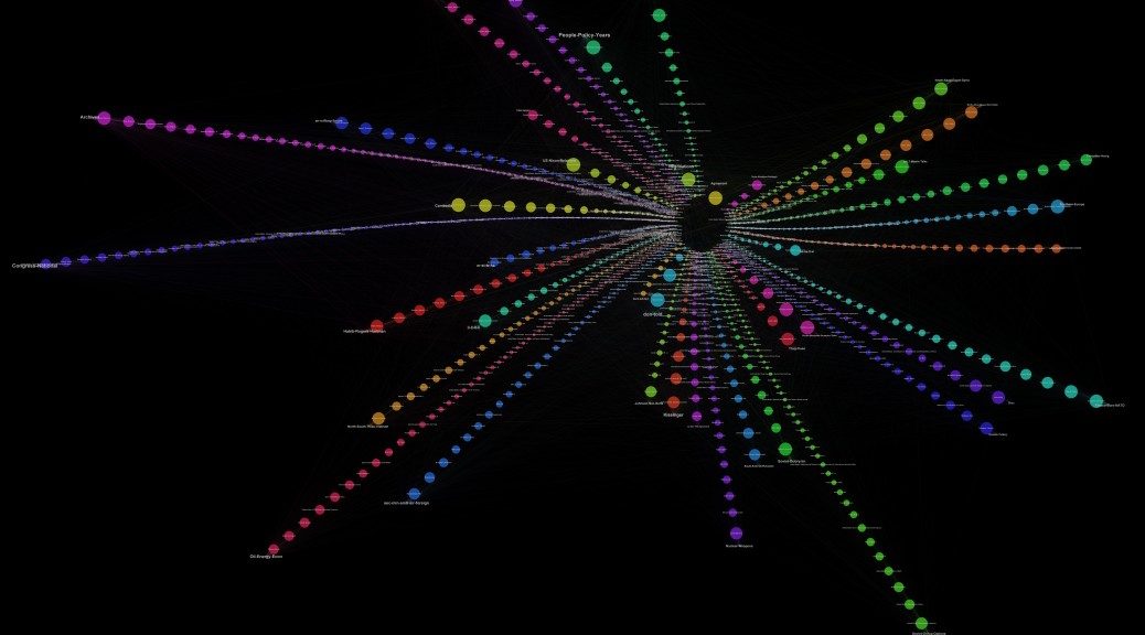
This radial diagram is essentially 40 bar graphs (one for each of the topics in the memcons topic model), with the most influential individuals represented by the largest circles at the outermost edge of each spoke. Associated individuals are ranked by the frequency with which they are mentioned in documents related to each of the 40 topic models. Individuals related to more than one topic are grouped according to the topic to which they are most heavily weighted, and are connected by lines indicating the other topics to which they are also related. In essence, this provides a ranked visualization of individual and organizational association with each of the 40 topics of the topic model.

‘Individual/Organizations to Documents to Topics’ Influence Force Graph
KT-topicsdocsindivs-thumb

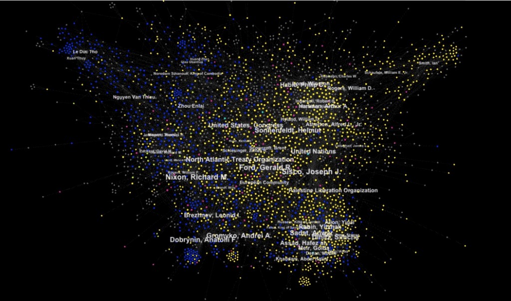
This is a force-directed diagram that shows the relationship of documents to topics, in addition, it shows the relationship of individuals and organizations named in the DNSA metadata to the documents. Note the close proximity of associated individuals to their respective geopolitical topics (eg Le Duc Tho, Andrei Gromyko, Rabin, Assad, Meir and others), a fairly striking visualization of the apparent compatibilities between the machine-generated topic model and the human-generated library metadata.

The grey dots/lines represent individuals mentioned in the memcons, blue dots/lines represent documents with ‘Top Secret’ classification status, the yellow dots are ‘Secret,’ the pink dots are ‘Unclassified’ and the 40 topics of the topic model are displayed as purple circles with text. Documents sharing similar topic weightings are clustered together, and placed at a relative distance from those topics. The placement of documents and topics related to matters of high military or national security significance among the bluish upper left region is unsurprising, as is the placement of ‘laughter’ so far on the other side of the graph. The placement of the ‘Cambodia’ topic outside that military arc, much closer to ‘Laughter’ than, say, ‘Vietnam’ or ‘Soviet,’ suggests strongly that the archive may contain only those documents of a less contentious or generic nature compared to those other topics.

‘Individuals/Organizations to Documents Influence’ Force Graph

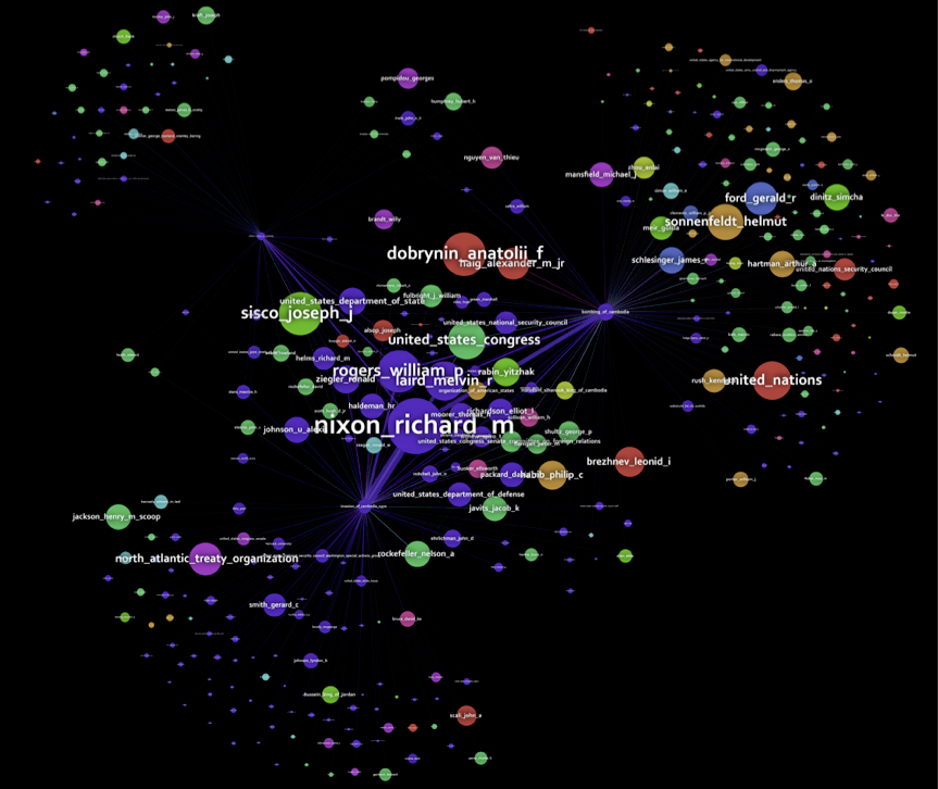
KT-indivstodocs-butterflyIn contrast to the Topics-to-Documents Force Directed Graphs, this graph shows the relationship of Named Individuals and Organizations in the documents with the documents themselves. Comparing and contrasting these with the Topics-to-Documents Graphs immediately prompts fascinating questions.