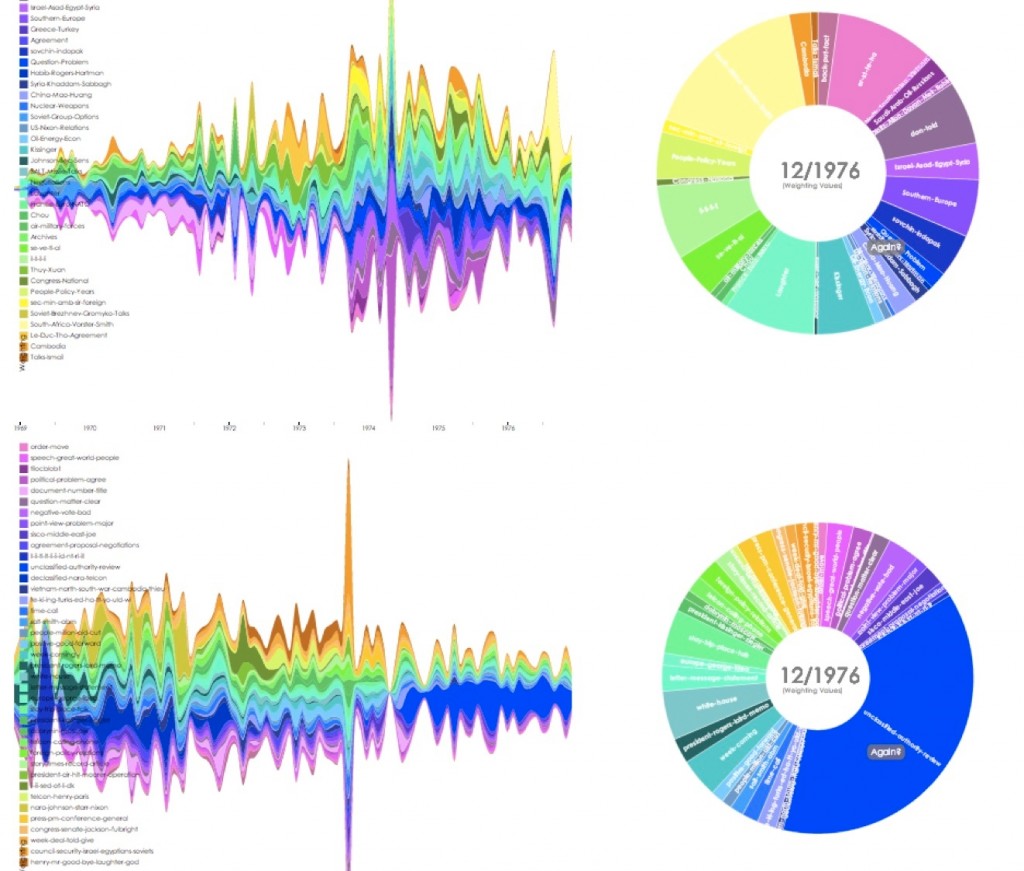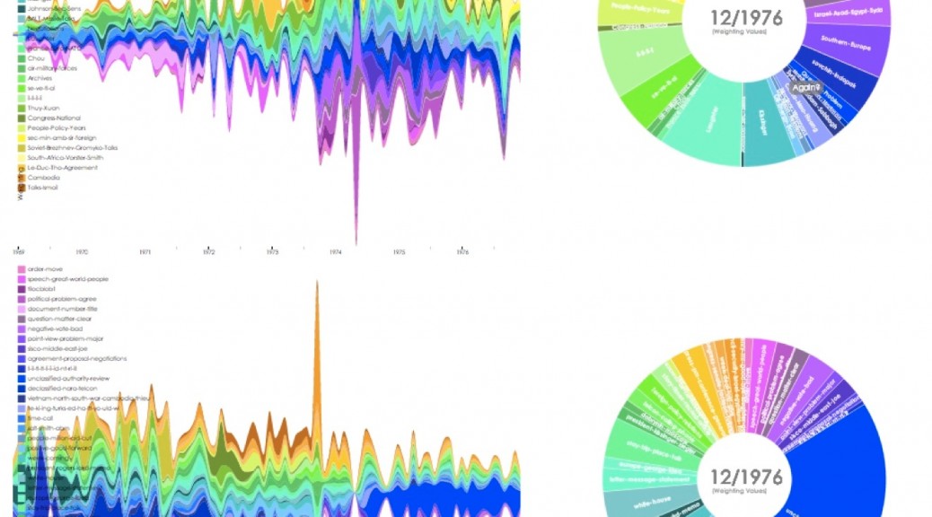
The colored streams represent each of the 40 topics of the topic models created for the memcons (top) and the telcons (bottom). The pie graph at the right of each graph shows the relative proportion of topic weight for each month of correspondence. The difference in density between the memcons (which show more activity at the end of Kissinger’s tenure) and the telcons (which show more activity at the beginning) are explained in large part by his promotion to Secretary of State in 1974. Before that time, when he was National Security Advisor, Kissinger utilized telephone conversations to address most of the issues confronting him. After his promotion, he shifted to a more official forum of meetings and memoranda for most of his work.
This interactive diagram can be played back, and various months explored in more detail – for example, the largest spikes in the telcons and memcons correspond to the timing of Kissinger’s promotion to Secretary of State, and to meetings regarding the October 1973 Yom Kippur War and the resultant flurry of diplomatic activity to broker agreements between the combatants in May 1974.
Interactive Topic Model Stream Graphs