Topic Modeling Stream Graphs

The colored streams represent each of the 40 topics of the topic models created for the memcons (top) and the telcons (bottom). The pie graph at the right of each graph shows the relative proportion of topic weight for each month of correspondence. The difference in density between the memcons (which show more activity at the end of Kissinger’s tenure) and the telcons (which show more activity at the beginning) are explained in large part by his promotion to Secretary of State in 1974. Before that time, when he was National Security Advisor, Kissinger utilized telephone conversations to address most of the issues confronting him. After his promotion, he shifted to a more official forum of meetings and memoranda for most of his work.

This interactive diagram can be played back, and various months explored in more detail – for example, the largest spikes in the telcons and memcons correspond to the timing of Kissinger’s promotion to Secretary of State, and to meetings regarding the October 1973 Yom Kippur War and the resultant flurry of diplomatic activity to broker agreements between the combatants in May 1974.

Interactive Topic Model Stream Graphs

streamgraphs

Topic Modeling Area Graphs

The capability to go beyond merely counting word frequency to measuring the correlations in frequency between words is a powerful tool for computational historical research. This technique, called ‘topic modeling,’ relies upon complex probabilistic mathematics beyond the capabilities of most historians. Using a variant of MALLET (open-source topic modeling software), I have assembled topic models of the Kissinger collections. The initial results of this process resulted in a 40-category list for both the memcons and telcons collections. By compiling the topic modeling data and graphing each topic’s frequency data into an x/y line/area graph, a contextual, historical timeline emerges for each of the 40 Kissinger memcon and telcon topics. Peaks in the graphs indicate the dates of documents that contain the highest cumulative ‘weighting,’ or relevance, to that respective topic. Immediately, the data graphed on the timeline evokes questions: many of the peaks on the topic graphs synchronize well with related events in the historical record. Examining each topic graph in relation to these historical timelines is in itself a useful exercise for researchers in finding content related to a particular topic.

For example, those interested in reading documents most closely associated with the wars in Indochina and Kissinger’s Paris Peace Conference talks with Le Duc Tho and Xuan Thuy, Chairman Mao and Chou En-lai, the Cambodia Campaign and resulting public outcry in May 1970, the ‘Backchannel’ and SALT talks with Dobrynin, Gromyko, Brezhnev, or other topic areas of Kissinger’s activity can use these graphs to locate the relevant dates and documentation for their topics much more easily than by consulting a traditional index.

Memcons: Interactive Topic Model Area Graphs
memcons-months

Telcons: Interactive Topic Model Area Graphs
telcons-months

Topic Modeling Force-Directed Graphs (Interactive)

Memcons: Interactive Topic Model Force Graph
d3-memcons-force2

The placement of the ‘Cambodia’ topic outside that military arc, much closer to ‘Laughter’ than, say, ‘Vietnam’ or ‘Soviet,’ is very interesting, suggesting that the archive may contain only those documents of a less contentious or generic nature compared to those other topics.The “Cambodia” topic’s comparative proximity to the Laughter topic, clearly visible in this graph, reflects an uncharacteristically ‘jovial’ slant of the content of the documents in the Cambodia topic in comparison to those from the other topics of similarly grave military importance. It is an odd result that supports other findings that the archive’s “Cambodia” material on which this topic is based is likely a hand-picked, sanitized and non-representative selection of only the more congenial exchanges regarding Cambodia, specifically excluding tense and difficult situations. Memoranda detailing planning and execution of disavowed military incursions, involvement in the installation of the Lon Nol regime, and other incidents are largely absent from the archive. Computational techniques here combined with a subjective historian’s assessment of the inapplicability of ‘laughter’ to topics like Cambodia, have thus uncovered a strong relationship between a document’s classification status and its subject matter. Further interpretations of the proximity of the ‘laughter’ topic (among others) to these geopolitical foci are detailed in greater depth in the written paper.

Telcons: Interactive Topic Model Force Graph
(NOTE: may take a while to load)

telcons-force-thumb2

Topic Modeling performed using ‘MALLET Topic Modeling Toolkit.’

Topic Modeling Force-Directed Graphs (Static)

Instead of a more traditional x/y axis graph, each memcon in the archive and their relation to the 40 topics of the topic model are represented here using a ‘force-directed’ diagram. More than prior figures, this graph is off-putting at first and requires a bit of orientation to understand. Here each document is represented by one of a network of small circles, connected by lines and placed at a distance from the larger circles (the topics) according to their respective association to each topic. The size of the topic circles and their textual labels reflects the total weight afforded to them by the documents in the archive, and the color of the small documents’ circles and connecting lines reflects the classification status of each document.

Memcons: Static Topic Model Force Graph
KT-Topics3-withnegotiations

This graph elegantly demonstrates in one view the interrelated ‘clusters’ of documents by proximity, their classification status, and the complex ways in which all documents relate to their constituent topic(s) and to one another. Even more than the line/area graphs, this image synthesizes the information gathered through metadata analysis, n-gram counting, and topic modeling to present inter-relationships not always readily apparent from a tabular view of the underlying data.

The blue dots/lines represent documents with ‘Top Secret’ classification status, the yellow dots are ‘Secret,’ the pink dots are ‘Unclassified’ and the 40 topics of the topic model are displayed as grey circles with text. Documents sharing similar topic weightings are clustered together, and placed at a relative distance from those topics. The placement of documents and topics related to matters of high military or national security significance among the bluish upper left region is unsurprising, as is the placement of ‘laughter’ so far on the other side of the graph. It is also notable that this upper left hand area of the graph contains those countries at the heart of Nixon and Kissinger’s vaunted “triangular diplomacy.” The topics concerning Soviet Union, China, Vietnam, and related topics are all placed in close proximity to one another occupying a close-knit area of the graph, suggesting that when those topics were mentioned they were often mentioned together. There is another fascinating topic in this topic model revealed by this graph, one with a unique significance. The “Laughter” topic is based upon those documents in which the transcriber literally placed the phrase “[laughter],” representing jovial, lighthearted moments of Kissinger’s correspondence in which the participants had a chuckle. A historian would expect these sorts of emotional expressions to occur in inverse proportion to the gravity of their respective topics (for example, the least ‘laughter’ during those negotiations in which relations were at their most sensitive, tense and/or adversarial), and the placement of the “Laughter” topic at the furthest possible point from topics relating to the Soviet Union, China and Vietnam negotiations validates this interpretation.

Individual/Organizational Influence Graphs

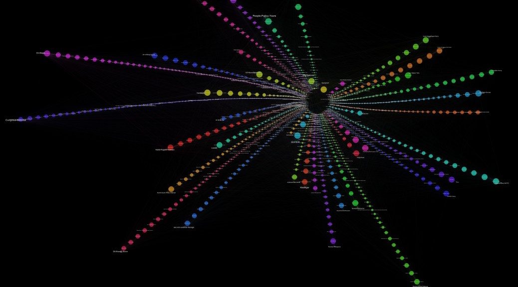
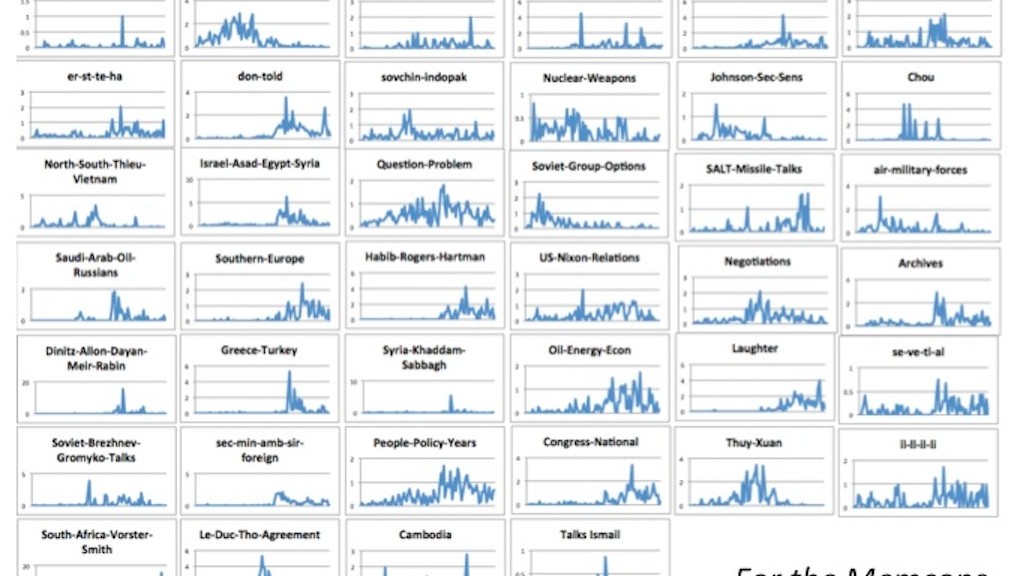
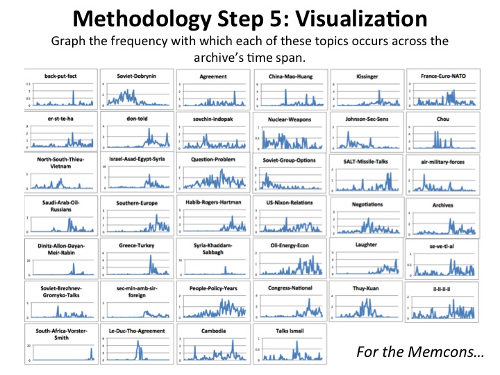
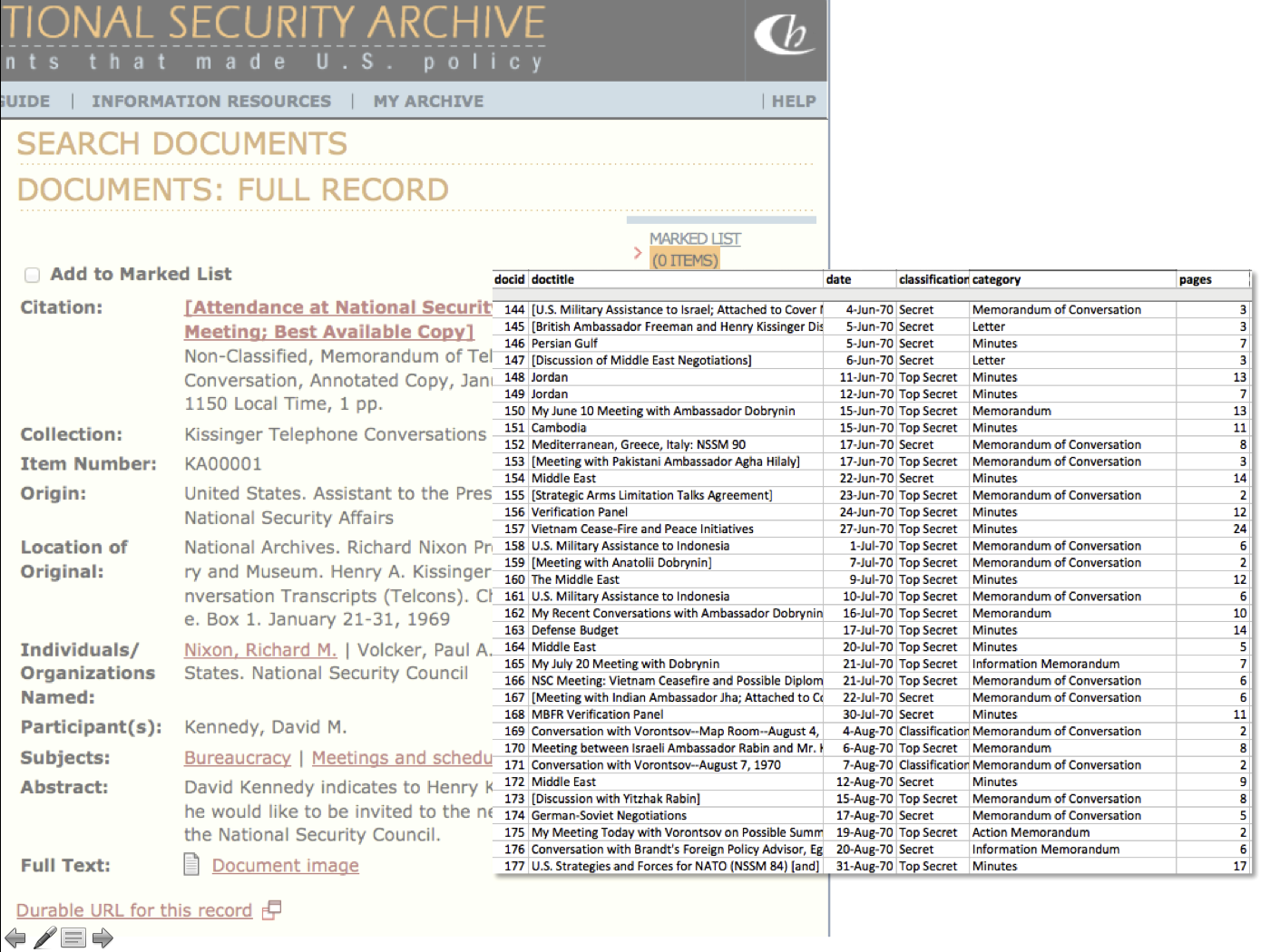
‘Individual/Organizations to Topics’ Influence Force Graph
memcons-indivs

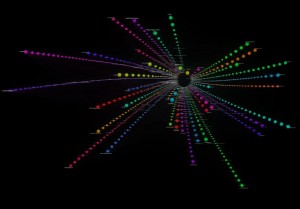
This radial diagram is essentially 40 bar graphs (one for each of the topics in the memcons topic model), with the most influential individuals represented by the largest circles at the outermost edge of each spoke. Associated individuals are ranked by the frequency with which they are mentioned in documents related to each of the 40 topic models. Individuals related to more than one topic are grouped according to the topic to which they are most heavily weighted, and are connected by lines indicating the other topics to which they are also related. In essence, this provides a ranked visualization of individual and organizational association with each of the 40 topics of the topic model.

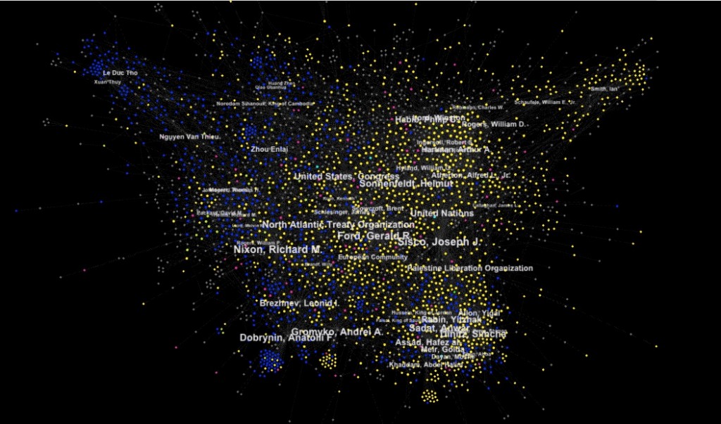
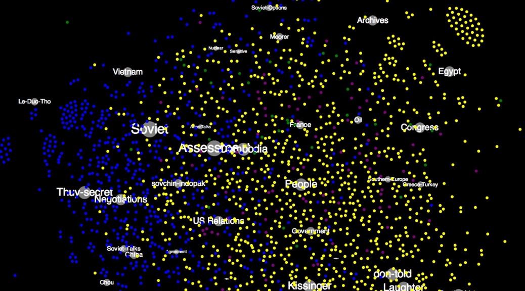
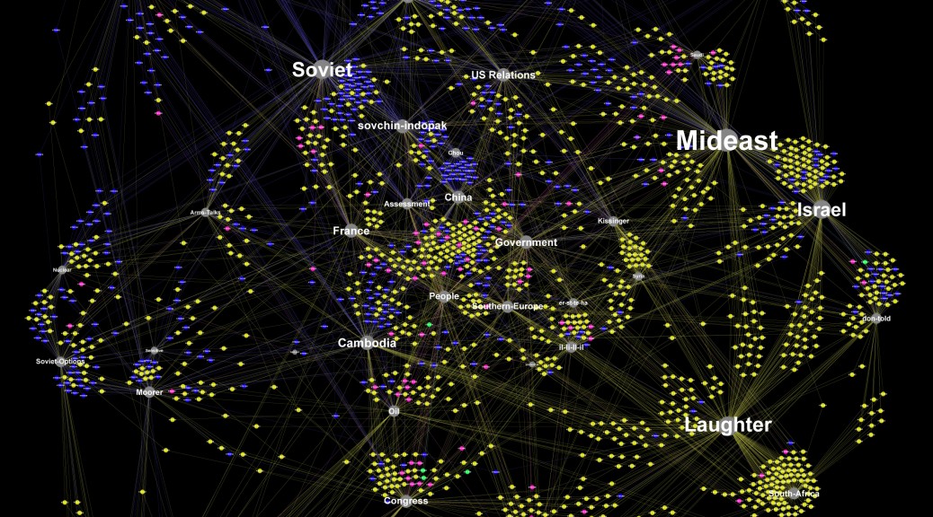
‘Individual/Organizations to Documents to Topics’ Influence Force Graph
KT-topicsdocsindivs-thumb

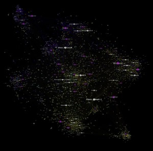
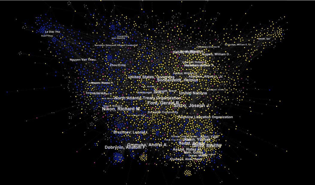
This is a force-directed diagram that shows the relationship of documents to topics, in addition, it shows the relationship of individuals and organizations named in the DNSA metadata to the documents. Note the close proximity of associated individuals to their respective geopolitical topics (eg Le Duc Tho, Andrei Gromyko, Rabin, Assad, Meir and others), a fairly striking visualization of the apparent compatibilities between the machine-generated topic model and the human-generated library metadata.

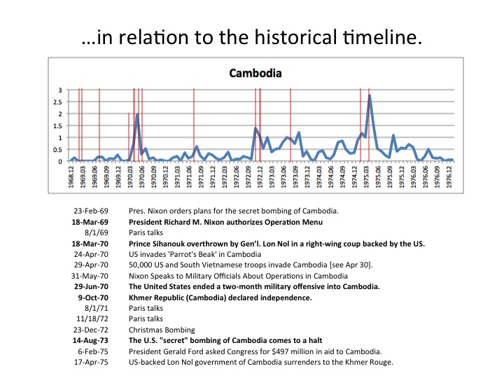
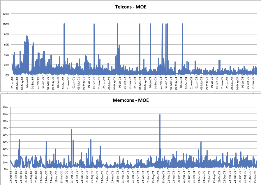
The grey dots/lines represent individuals mentioned in the memcons, blue dots/lines represent documents with ‘Top Secret’ classification status, the yellow dots are ‘Secret,’ the pink dots are ‘Unclassified’ and the 40 topics of the topic model are displayed as purple circles with text. Documents sharing similar topic weightings are clustered together, and placed at a relative distance from those topics. The placement of documents and topics related to matters of high military or national security significance among the bluish upper left region is unsurprising, as is the placement of ‘laughter’ so far on the other side of the graph. The placement of the ‘Cambodia’ topic outside that military arc, much closer to ‘Laughter’ than, say, ‘Vietnam’ or ‘Soviet,’ suggests strongly that the archive may contain only those documents of a less contentious or generic nature compared to those other topics.

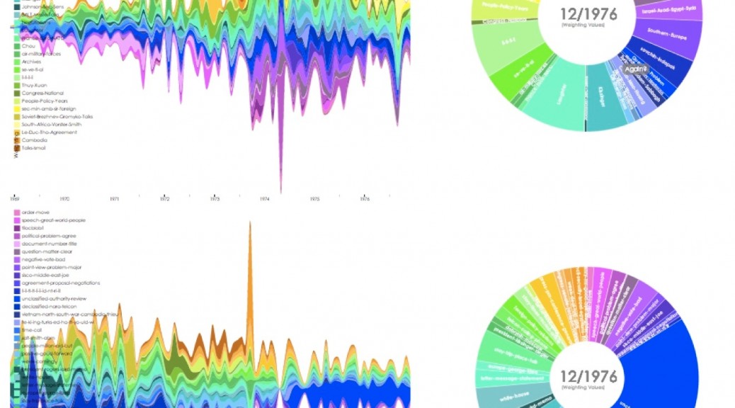
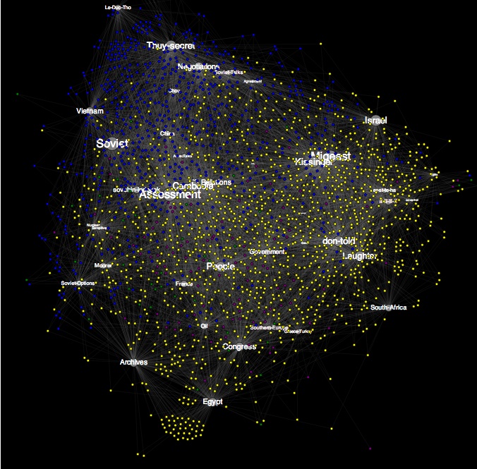
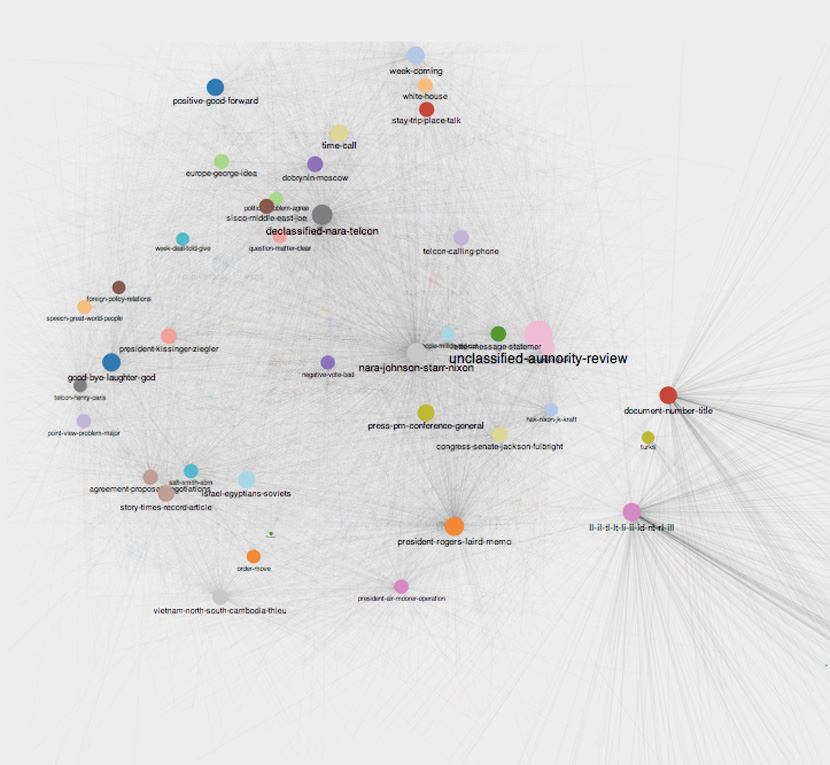
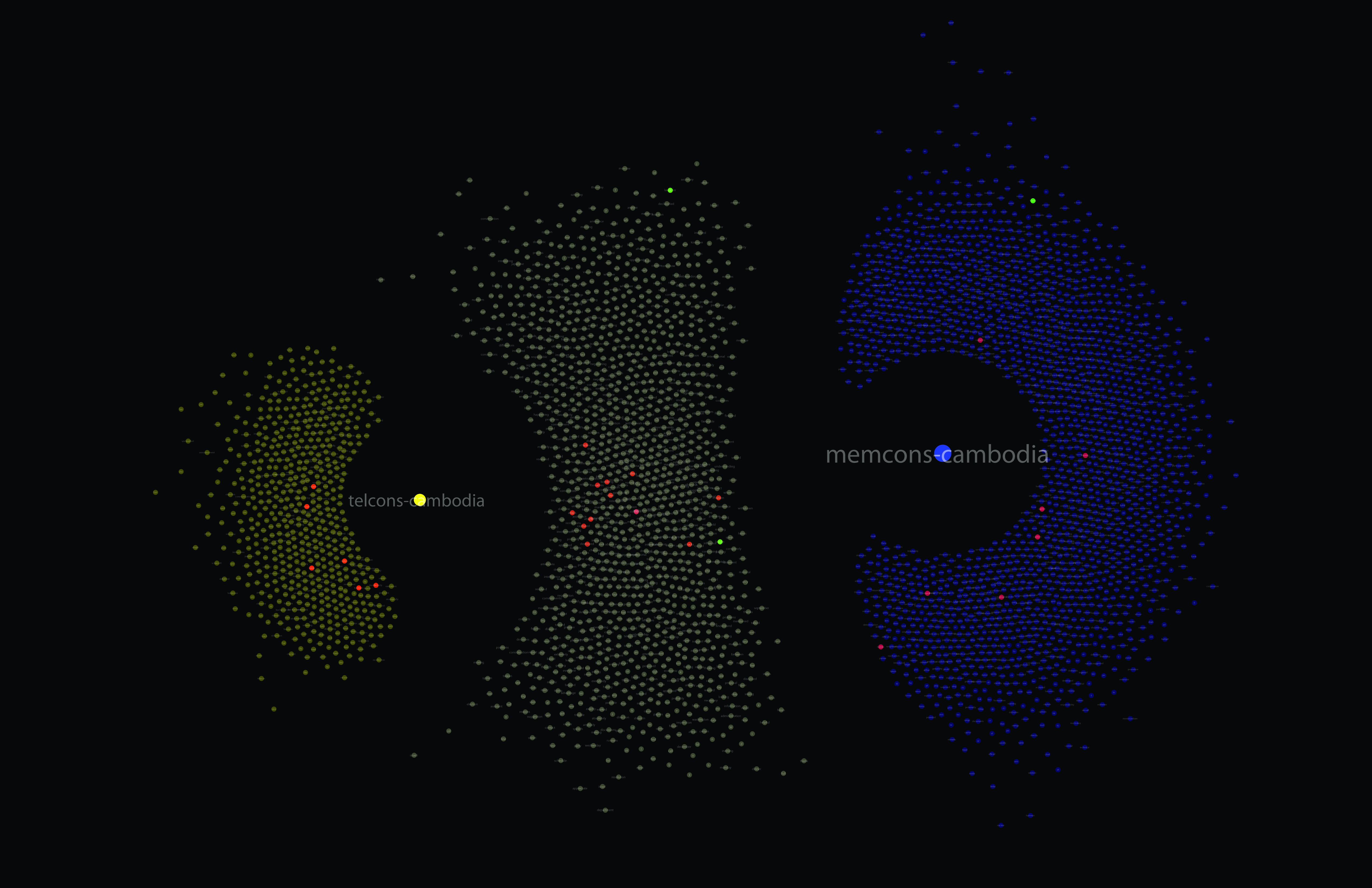
‘Individuals/Organizations to Documents Influence’ Force Graph

KT-indivstodocs-butterflyIn contrast to the Topics-to-Documents Force Directed Graphs, this graph shows the relationship of Named Individuals and Organizations in the documents with the documents themselves. Comparing and contrasting these with the Topics-to-Documents Graphs immediately prompts fascinating questions.

Word Collocation: Target Word ‘Bombing’

‘Bombing’ Word Collocation Force-Directed Graph
BombingCorrelation-big

First and perhaps most strikingly, the MI score and the frequency of the words “Cambodia” and “Vietnam” in collocation with the word “bombing” differs greatly between the two channels of communication. When Kissinger and his associates were using the word ‘bombing’ in official meetings, it was associated much more with words related to ‘Vietnam’ than in the telephone conversations, in which ‘bombing’ was seen to have a higher MI score (collocation) with the names of other countries in Indochina (Laos, Thailand and Cambodia).

It is unsurprising that Kissinger would use the telephones (as National Security Advisor) as compared to formal meetings to discuss bombing in Indochina, given the differences in his expectations of privacy in those two different fora of conversation. However, more than just a quantitative representation of ‘candor,’ this difference may also suggest an absence of material – ‘Top Secret’ memcons on military aspects of the ‘Cambodia’ topic, for example.

‘Bombing’ Word Correlation Interactive Force-Directed Graph
d3bombing-thumb

This is an interactive ‘d3’ version of the force-directed word collocation analysis of the word ‘Bombing’. Currently, the diagram does not take ‘edge weights’ into account, so the nodes within each cluster are placed inexactly.

Until ‘edge weight’ code is completed, static graph above is far more accurate and ‘stable’.

Word Collocation: Target Word ‘Cambodia’

‘Cambodia’ Force Directed Word Frequency/Collocation Graph
cambodia

Words related to violence (bombing, attack, invade, etc.) were more likely to be seen in high collocation – MI (Mutual Information) score – with the word “Cambodia” in the Telcons than in the Memcons, which displayed a greater MI score between ‘Cambodia’ and words related to laughter.

Word Collocation Analysis performed using ‘AntConc’ by Laurence Anthony.

Sentiment Analysis Line Graphs

‘Past/Present/Future’

In these two graphs the percentage of past, present and future tense is displayed. Despite the reputation Kissinger maintains as a forward-looking diplomatic master, it was in fact the past tense that predominated in language at the beginning of the administration in both forms of correspondence, Later, ‘present tense’ became more prevalent, with the crossover happening nearly simultaneously at the end of 1969 in both forms of correspondence. At no time did the use of ‘future tense’ predominate.

Quartz %d

‘Anger/Anxiety/Sadness’

In these two graphs the levels of ‘anger’, ‘anxiety’ and ‘sadness’ are displayed. Notably, the level of ‘anger’ reached a simultaneous peak in both correspondences during the latter quarter of 1973 as Watergate loomed, Vice President Spiro Agnew resigned and the “Saturday Night Massacre” resulted in the resignation of Elliot Richardson, unwilling to fire special prosecutor Archibald Cox. There are a few other peaks of ‘anger words’ visible in the meeting memoranda, one occurring in late 1975 at the time of the fall of Saigon and Phnom Penh as well as a slow swell occurring from 1969-1972.

Quartz %d

Topic Model Line Graphs

These graph thumbnails and closeups detail the topic weighting for a specific topic of the 40 topics in the topic model, each laid out on a timeline. The red lines represent selected historical events (listed in the sidebar to the right of the graph) displayed on the timeline for comparison to the changing topic data.

Memcons Topic Model ThumbnailsSlide24

Telcons Topic Model ThumbnailsSlide25

Detailed Timeline – Memcons ‘Cambodia’ TopicSlide27

Detailed Timeline – Memcons ‘Le-Duc-Tho-Agreement’ TopicSlide28

Additional Findings

Slide38 Slide39 Slide40 Slide41 Slide42

About the Sources and Process

The DNSA’s Kissinger Collection comprises 15,502 telephone conversation transcripts (telcons) and 2163 meeting memoranda transcripts (memcons).

Example-Memcon-and-Telcon

Following declassification, these documents were gathered up by the DNSA, analyzed and curated, and hosted on their online site along with a page of metadata for each document. This data was scraped and converted into a table with a document for each row, and a column for every available metadata property.

Screen Shot 2014-08-01 at 6.16.19 AM

Now, with the metadata cleaned and organized, the documents were put thru Optical Character Recognition, which resulted in (roughly) a 6% margin of error when put through a limited spell check. These OCR results are interesting for a number of reasons, the spikes corrleating to documents where there were no correctly-spelled words because the documents were replaced with handwritten withdrawal slips, an unintended finding aid. It’s also important to note that if a document’s OCR process resulted in it recognizing a word as another, correctly spelled word (eg ‘see’ / ‘sea’) that would not count as an error in this calculation.

Screen Shot 2014-08-01 at 6.20.41 AM

The resulting text files (spell checked but not corrected) were then processed using a number of tools. For Word Frequency and Collocation we used AntConc:

Screen Shot 2014-08-01 at 6.23.42 AM

for Topic Modeling we used MALLET, and for Sentiment Analysis we used LIWC2007.